Table of contents
The design of an online store is fundamental to winning over your audience. We prepared some advice on how to capture users’ attention. We are sure this can help you find an appropriate website design.
Before launching your online store, you need to decide on its visual layout. The Cartum website builder offers over 200 site designs tailored to various niches. We hope this overview helps you choose the best template for your store.
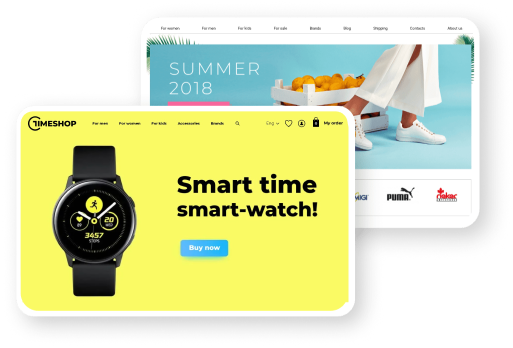
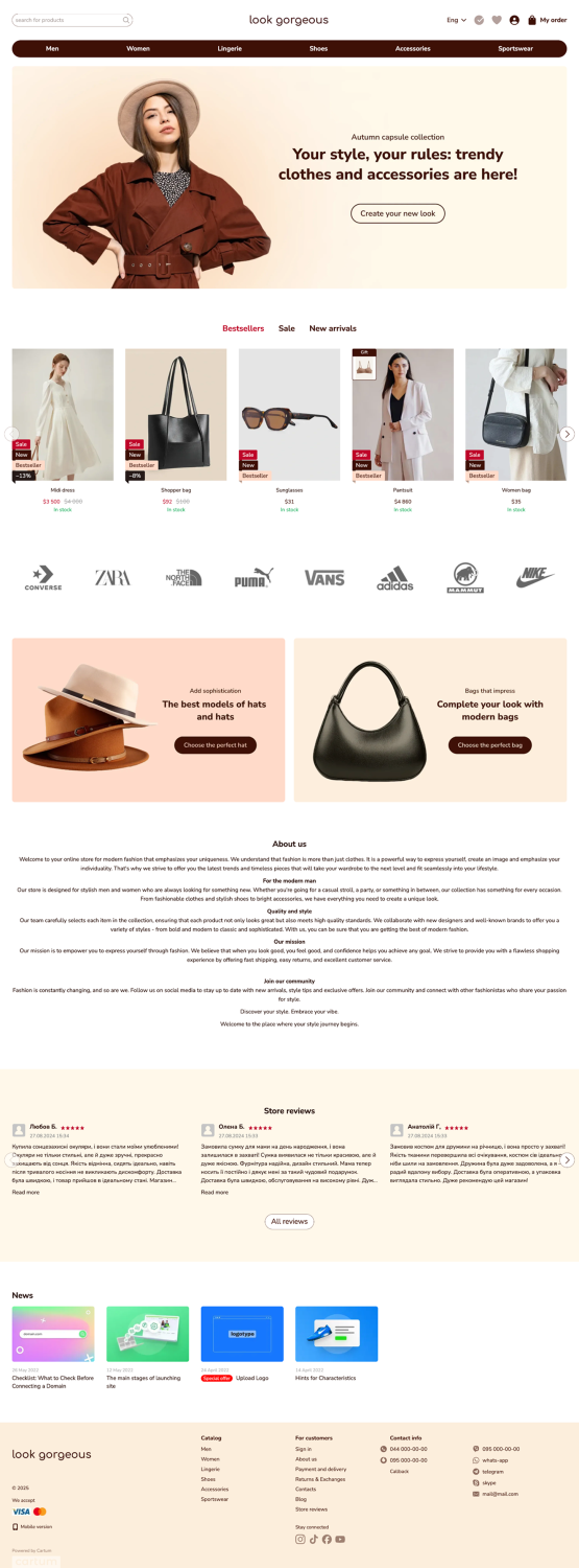
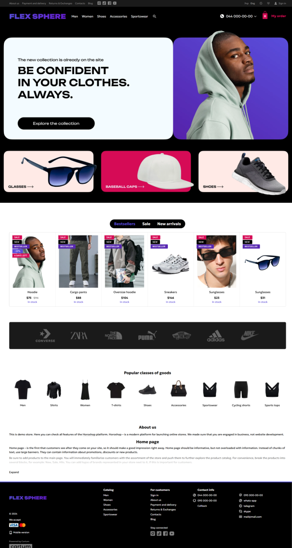
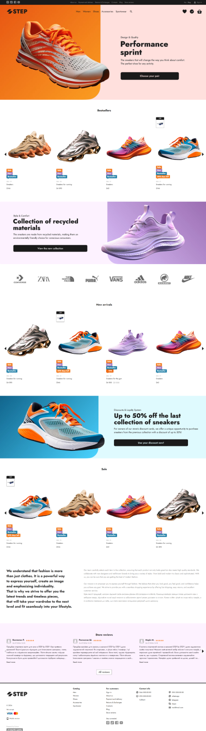
Clothing and Footwear
The main trends for clothing and footwear e-commerce design are ample white space, minimalism, and stylish banners. The best primary interface colors are black and white. To create contrast, it’s a good idea to add a bright banner strip on the homepage.
One of the main drawbacks of buying clothing and shoes online from the customer’s perspective is the inability to try items on and the risk they won’t fit in terms of size or style. That’s why a size chart is essential in the product page, along with plenty of photos. It’s important to include images not only from different angles but also worn on a model. The catalog should use horizontal filtering, which allows users to see all available filters at once. This also leaves more space for product cards.
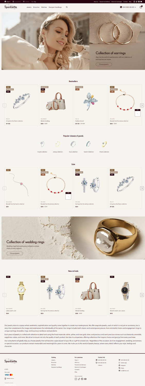
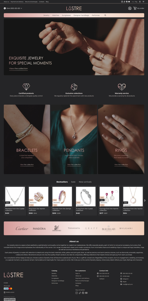
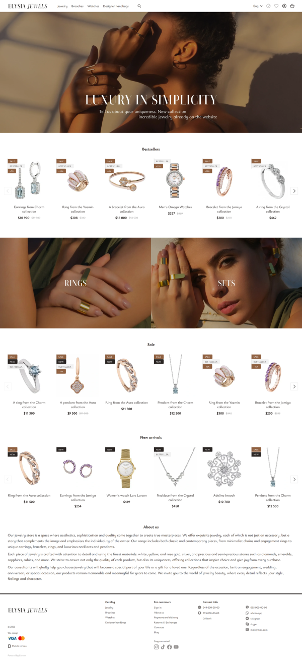
Jewelry
For stores selling high-end products, building trust with users is crucial — and a restrained design is the best way to achieve that. Avoid using overly bright visuals; instead of bold colors, opt for more muted, pastel tones.
Jewelry photos often feature a predictable color palette in shades of gold and silver. That’s why it’s a good idea to use colored backgrounds for images or include an accent shade in the design that complements the product photos without clashing. It's also better to make the product cards larger, as this immediately draws the user's attention.
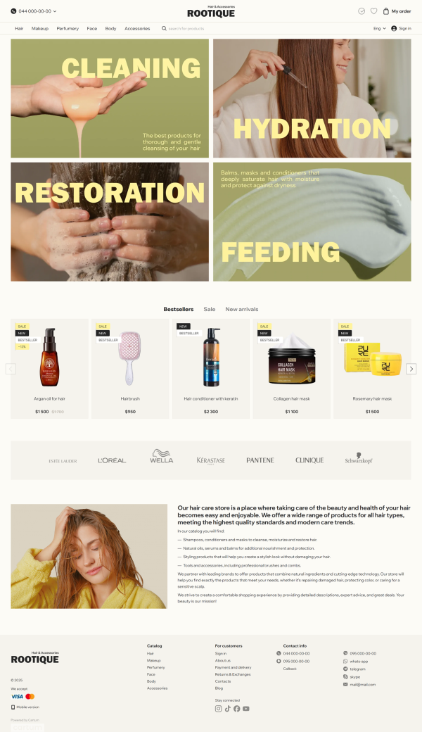
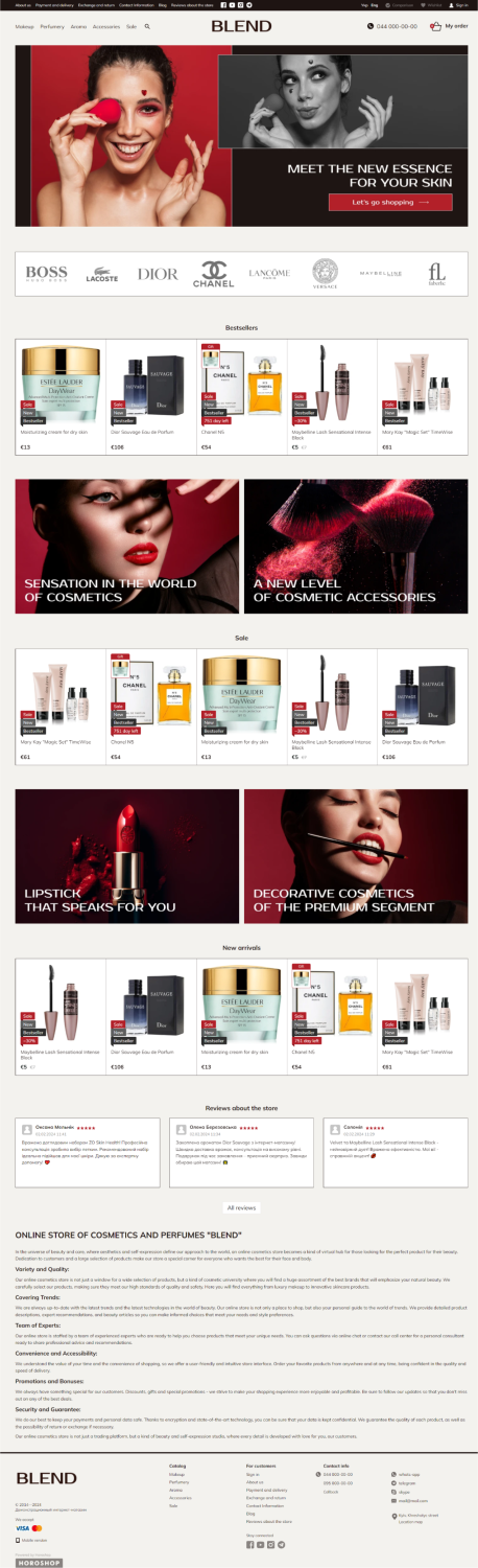
Cosmetics
The cosmetics niche is multifaceted, so when choosing a template, consider the specific features of your products and your target customer profile. For example, a dark website design with a contrasting but subtle interface works well for a men's cosmetics store. If your product range includes organic skincare, opt for calm, nature-inspired colors. And if you’re selling products mainly targeted at a younger audience, you can afford to experiment with a bright and bold design.
Regardless of the product type, aesthetics play a major role in cosmetics e-commerce. This makes unconventional, well-crafted banners a key feature for the homepage. Another essential element of a user-friendly cosmetics store is an extensive filter system. In addition to filtering by product category, include filters for product properties, purpose, skin type, country of origin, and more. This way, users can significantly reduce the time it takes to find the right item.
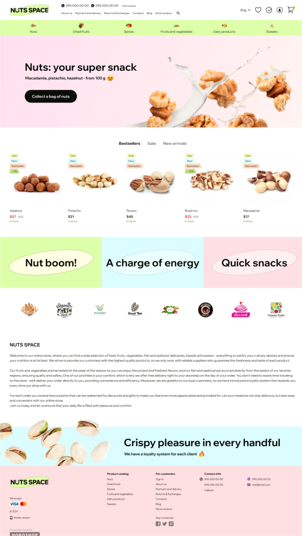
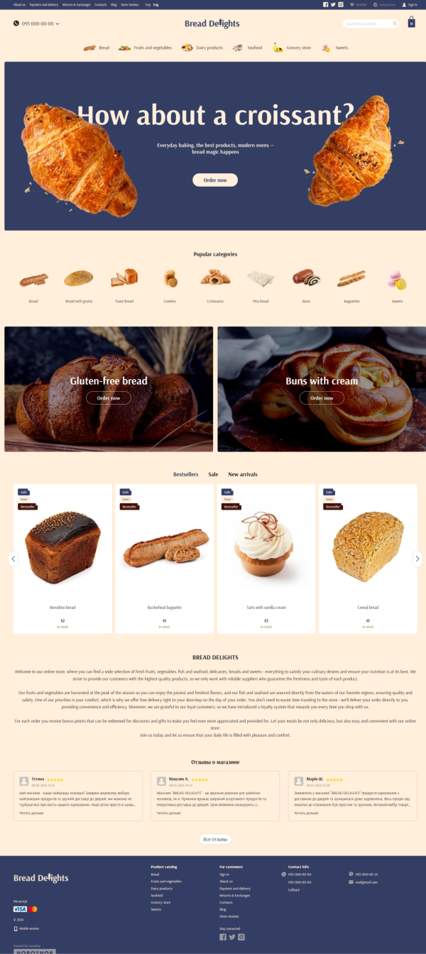
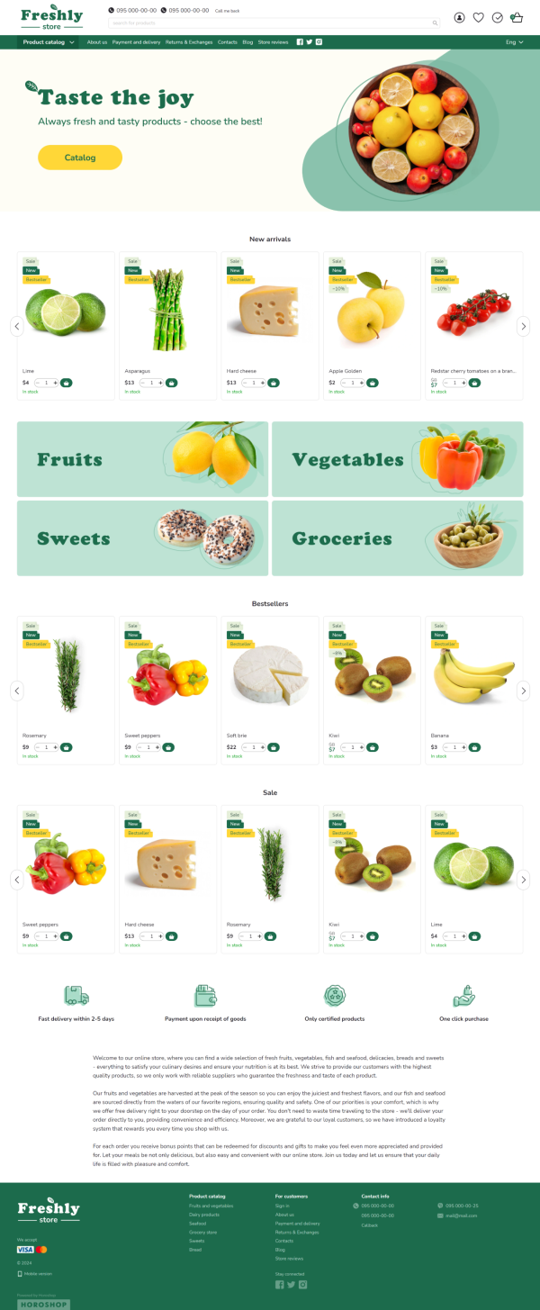
Food
The design of a food e-commerce site also depends heavily on the types of products you offer. Your site’s color scheme can vary drastically — from warm beige tones for a bakery to a vibrant, «summery» palette if you’re selling healthy treats like dried fruits, fruit leathers, and other snacks.
Frequent promotions are a distinctive feature of online food stores. Use plenty of bright sliders and don’t limit yourself to just one banner strip. Product cards should be compact, as the primary goal of a food store is to showcase the variety of available products.
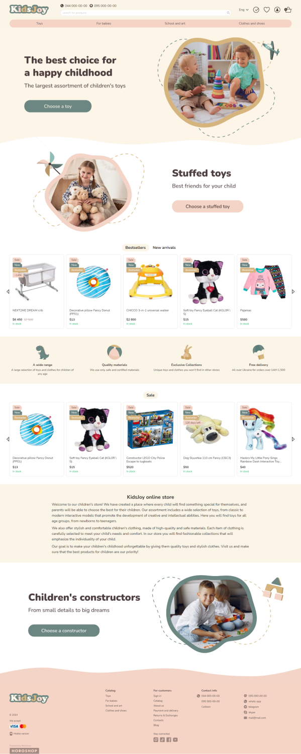
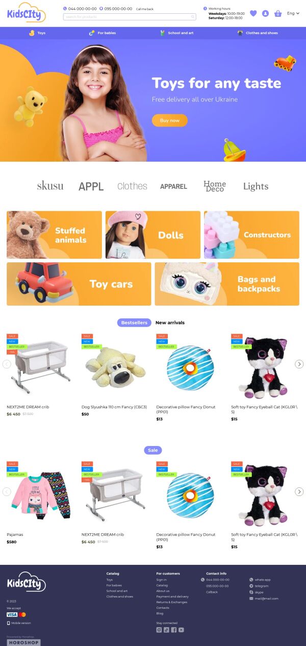
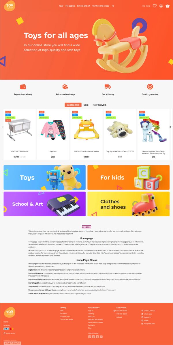
Children’s Products
When creating a store for children’s products, it’s important to remember that your buyers are the parents, not the children. That means a design with cartoon elements or popular animated characters might not be appropriate. However, incorporating a few bright accent colors to highlight the child-related theme is a great idea — just make sure they complement each other well.
Another essential feature of a children's product store is a filter by age, so that parents can immediately sort and view items that are suitable for their child.
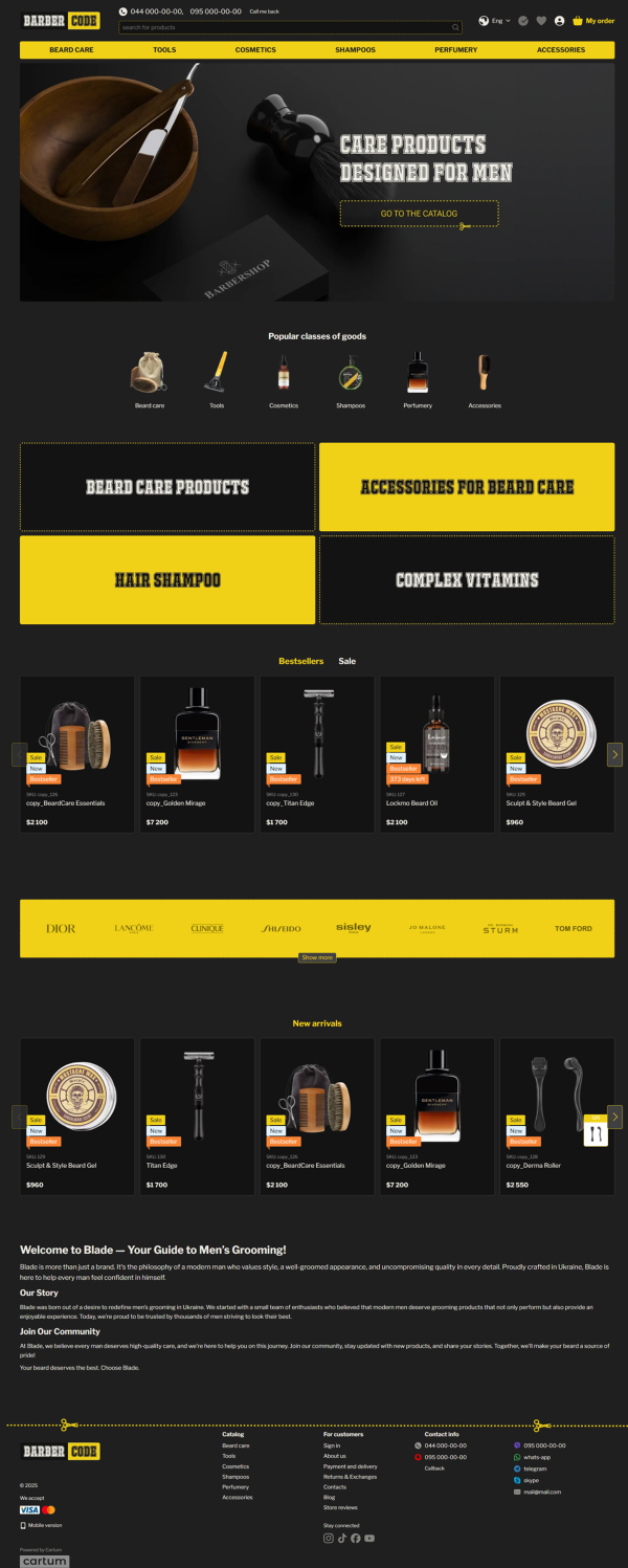
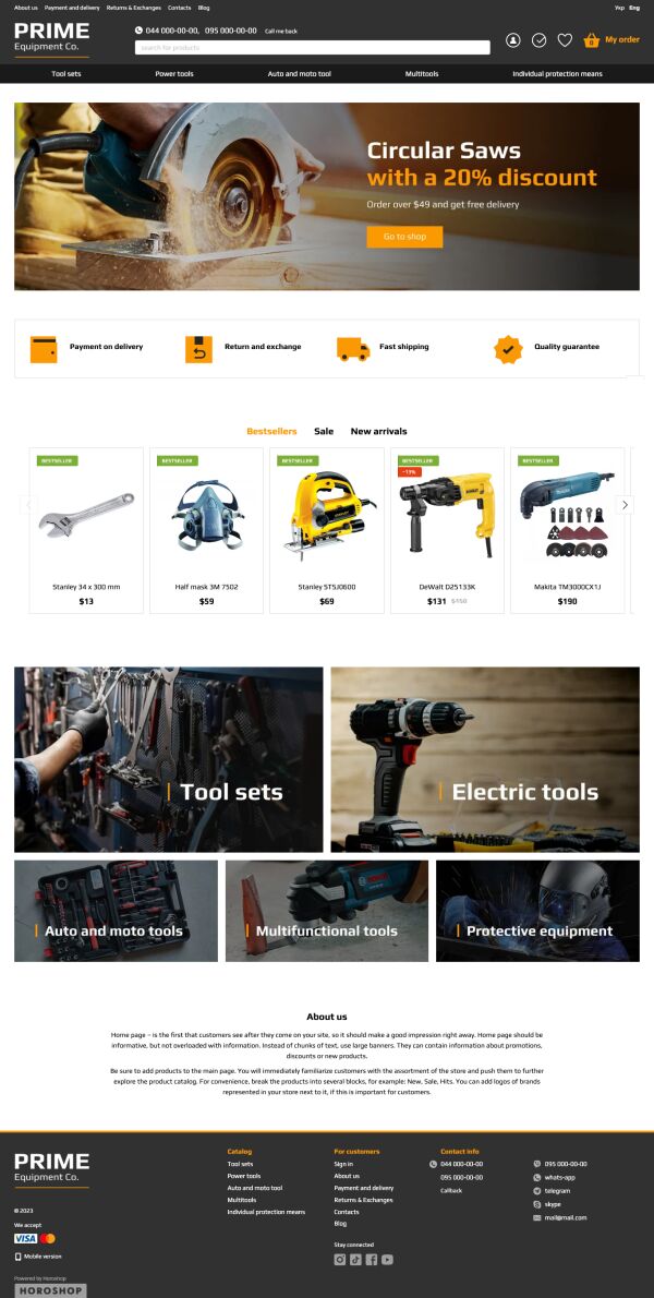
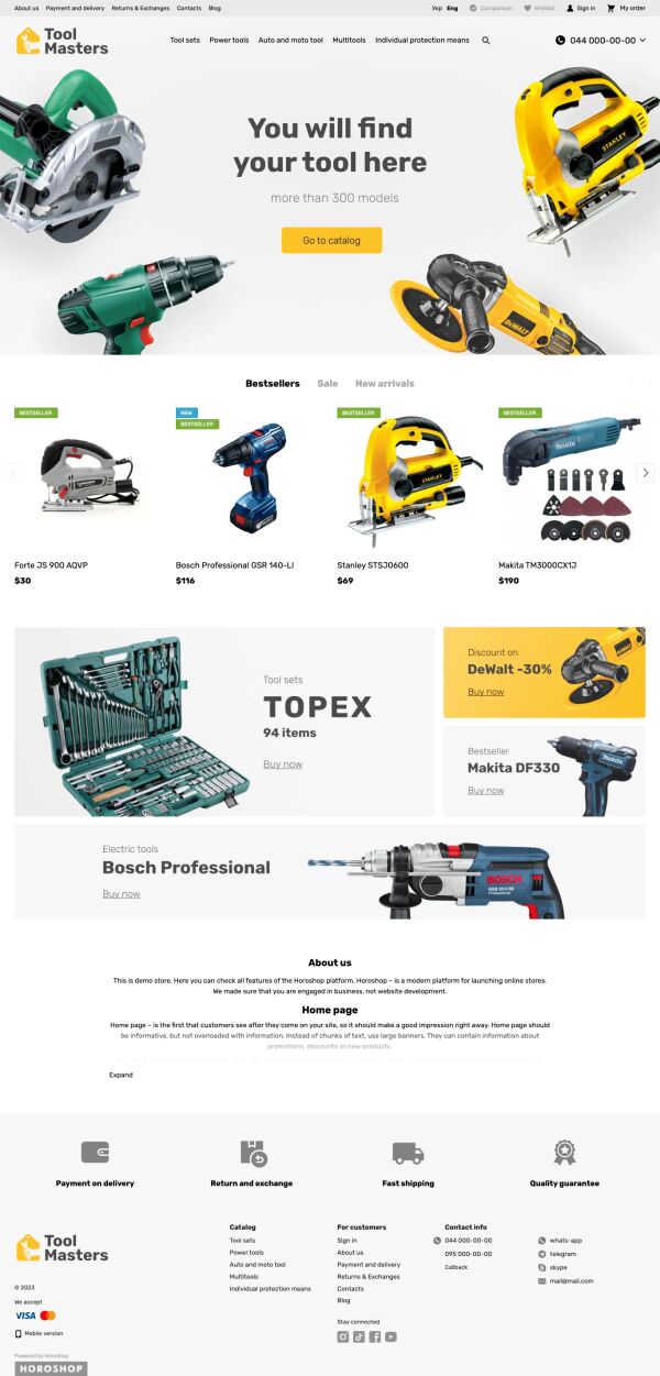
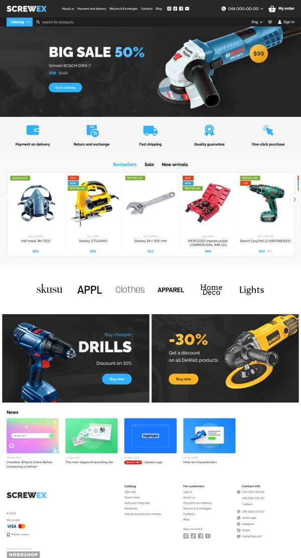
Power Tools and Repair Supplies
The target audience for power tools and repair supplies is mostly male, and the design should reflect qualities like durability, reliability, and precision. Choose a calm and professional color palette for the visual design. Shades of blue, green, pastel orange, gray, or graphite work particularly well. You’re free to choose other colors too, but avoid overly bright or flashy tones.
Since the primary focus in this category is on technical specifications, make sure each product card includes detailed descriptions and features. Also, provide enough parameters for convenient filtering — such as weight, power consumption, power source, and others.
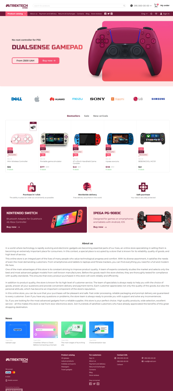
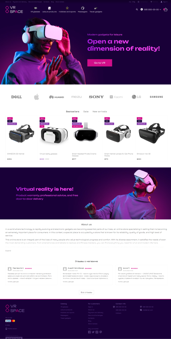
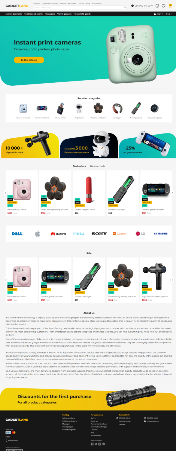
Electronics and Gadgets
Online stores selling electronics and gadgets can confidently use bright colors and multiple banners. It’s a good idea to include a brand showcase block on the homepage, as many users prioritize the manufacturer when choosing an electronic device. Product cards should not be too large — this niche typically involves a wide assortment, where specifications matter more than images.
Additionally, previewing the key product variations on hover is important. This allows users to quickly see, for example, whether a smartphone with the desired storage capacity or a smartwatch in their favorite color is available. Electronics tend to have many technical specifications, so a product comparison feature is especially useful on the product page. It allows users to visually compare similar devices without switching between tabs.
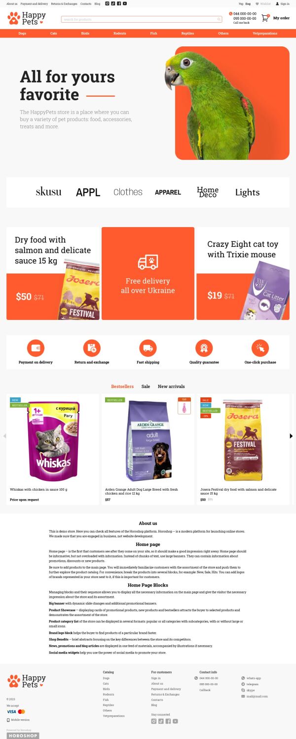
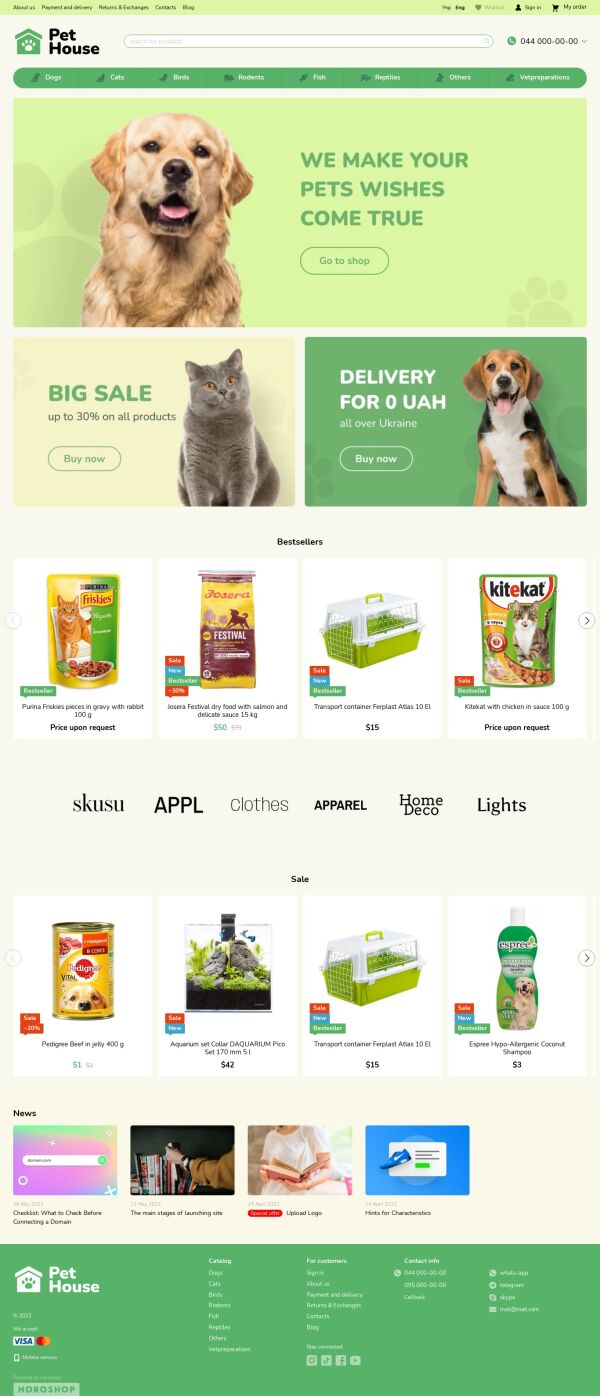
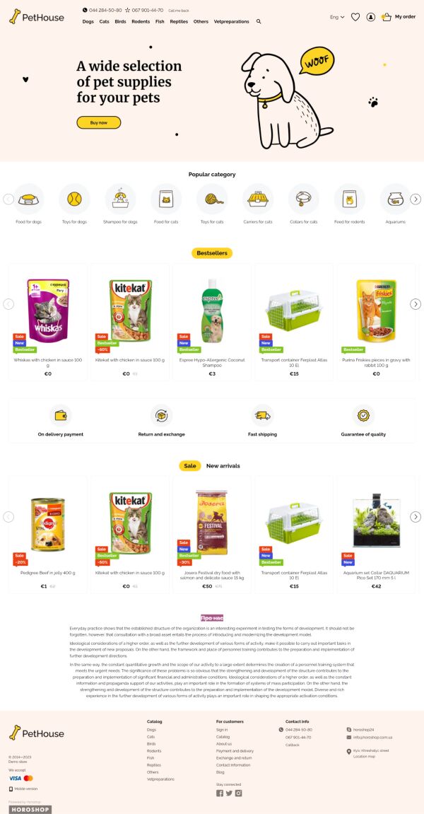
Pet Supplies
Pet supply e-commerce designs often feature vibrant colors and thematic graphic elements. Filters play a critical role here, enabling shoppers to quickly select products tailored to their specific pet.
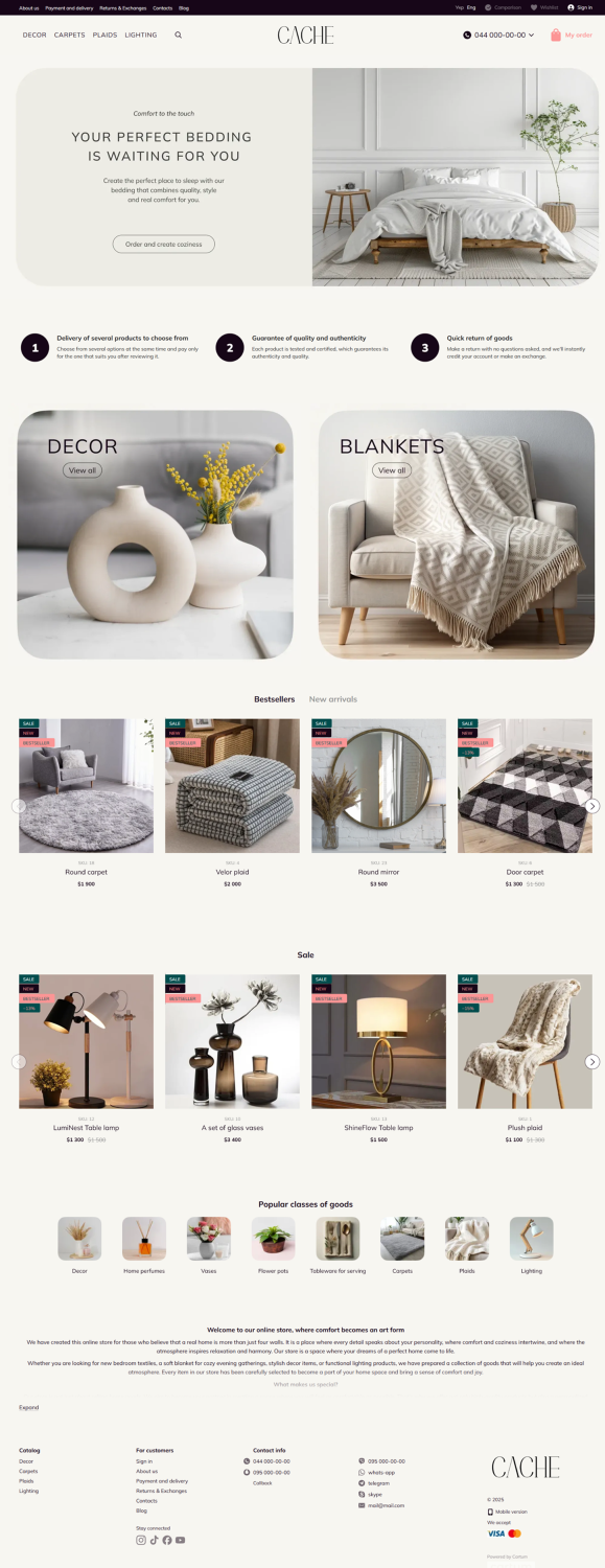
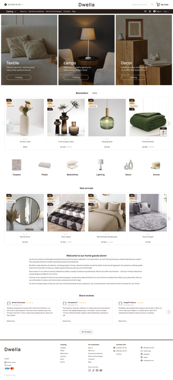
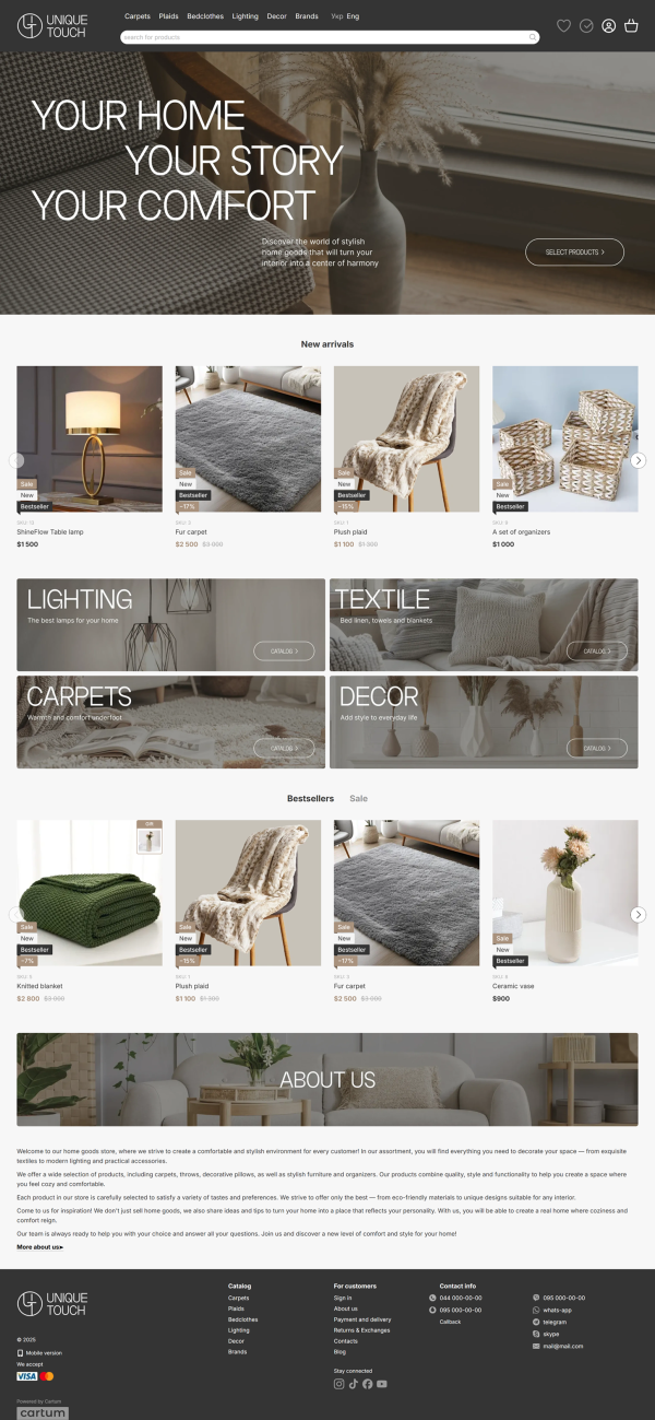
Home Goods
This niche is highly diverse, but a color scheme associated with home comfort — pastel creams, browns, and yellows — is typically suitable for presenting most home products. A minimalist white background with a moderately contrasting interface can also be a great solution. However, avoid showcasing items on a plain white background; instead, show how they look in a real interior setting.
Some home goods, like lighting fixtures, come with specific technical features. For such products, create an advanced filtering system — including power consumption, socket type, light output, and other parameters. Product cards can be made larger in this category, as appearance often plays a key role in the purchase decision.
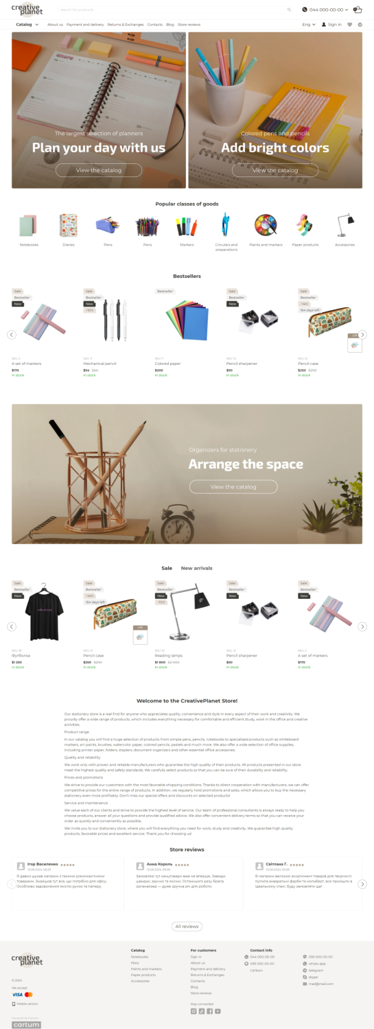
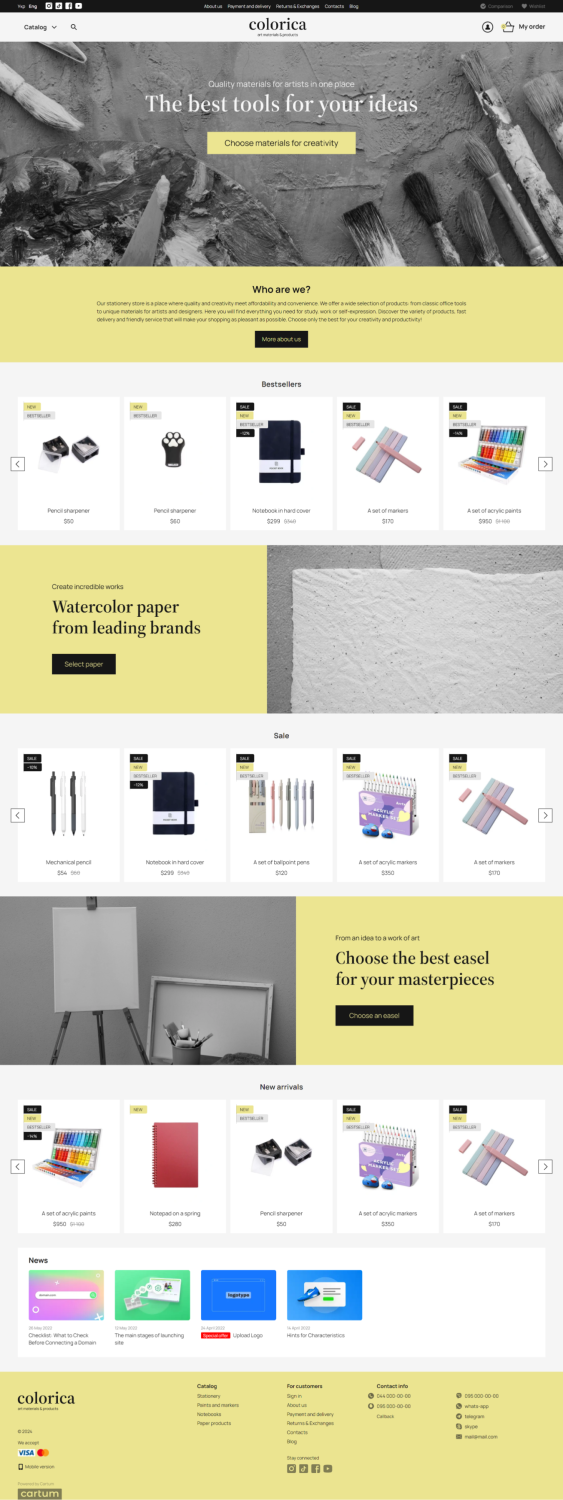
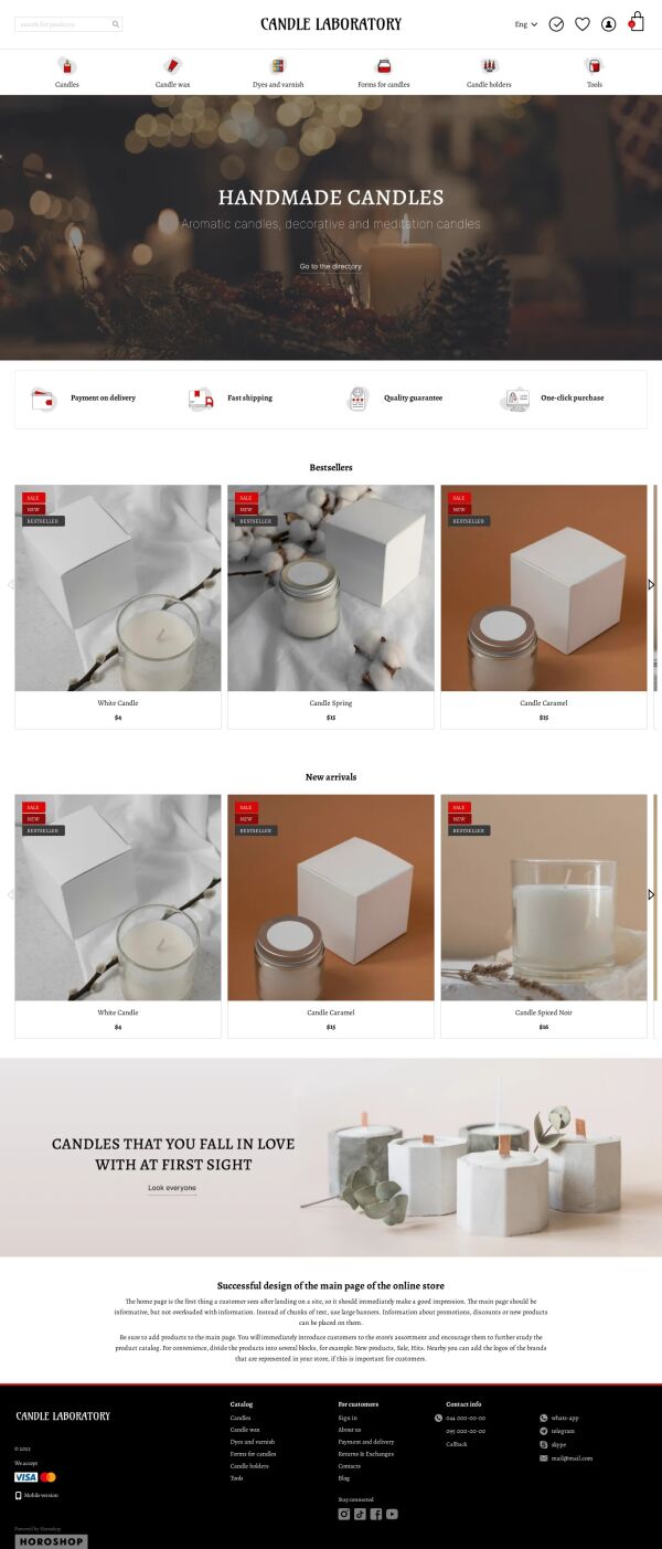
Hobby and Craft Supplies
What sets this category apart is its target audience. Buyers of DIY kits and various creative products are typically hobby enthusiasts, so the emotional aspect of the visual design is key. Aim to convey an atmosphere of aesthetics, inspiration, and ease. Creative design solutions are welcome, but be sure to strike a balance between vibrancy and minimalism.
Pastel tones like lavender, peach, and mint work well as primary colors. To create contrast, bright accents can be used in the interface. Product pages should include images of the final result — for example, finished cross-stitch patterns, paint-by-number artworks, handmade candles, and similar items.
Conclusion
Over 10,000 online stores have been built using our designs. Some clients selected one of the templates from our design gallery and made minimal changes, such as adjusting header or button colors. Others fully customized the visual layout within the capabilities of the Cartum platform, using the user-friendly design editor in the admin panel.
If you’d like to learn more, feel free to submit a request to create your online store. Our managers will walk you through the details. You’ll also be able to test a ready-made store for free for 7 days.
Start your own online-store
Free test 7 days