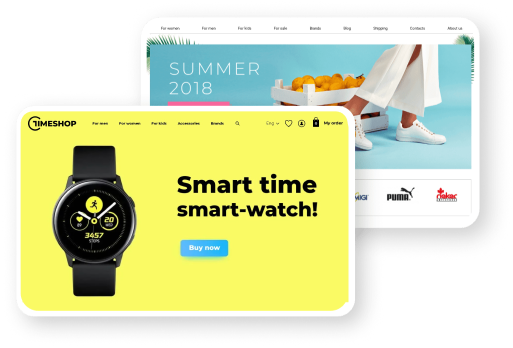
Call-to-Action (CTA) is an element that encourages users to take specific actions. CTA is often expressed in the form of a button and consists of text and/or graphics. A typical example of a call to action is the "Buy" button in an online store. It urges the customer to place an order and explains what will happen after the button is pressed. This is a classic CTA format that is widely used in marketing.
CTA is one of the key elements for various types of promotion, such as email marketing, contextual and banner advertising. The effectiveness of promotion depends on how interesting and clear the call to action is. Even if the newsletter is well composed, if it does not contain a CTA, it will not be effective. The user simply won't understand that they need to click a link to get a discount, register, etc. CTA is the key to converting advertising into action and achieving the desired result for the company.
Despite the visually small size of CTA, creating it requires significant effort. Let's consider the creation of a CTA using the example of a subscription form for a company newsletter.
- Determine the CTA task. In our case, the CTA task is to encourage users to subscribe to the newsletter. You need to make the audience want to receive the company's emails.
- Determine the location. CTA will be placed in a pop-up window on the company's website.
- Compose text. The text largely determines whether the user will click the button. If we're talking about a newsletter, it's not necessary to use a phrase like «Subscribe» as a call to action. In the pop-up, you can explain that you offer to subscribe to a newsletter with useful information, and in return, the user will receive a coupon with a discount. Thus, the CTA can sound like «Get discount».
- Choose the form, size, and color of the button. CTA should be visible and convenient. The button should stand out against the background of other elements so that users can easily click it. It's important to make sure that the button works correctly on both desktop and mobile versions.
To evaluate the success of CTA, you can use the CTR indicator, i.e., the percentage of users who click the button. You can also compare the number of target actions before and after changing CTA. For example, how many people subscribed to the newsletter in a month with the old call to action and the new one. To increase the effectiveness of CTA:
- transparently explain what the user will get in response to the action;
- conduct A/B testing to choose the best CTA option;
- make the call concise;
- use verbs, as we are talking about action;
- make sure the button stands out against the background of other elements;
- create an argumentation for why the user needs to click the button.


