The logo is one of the first things a visitor to an online store sees. It affects the perception of the site, forms the first impressions, and helps to stand out from competitors, generate customer loyalty and increase the recognition of the project. This article will tell you how to choose the best logotype for your online store and create it yourself.
The logo is one of the first things a visitor to an online store sees. It affects the perception of the site, forms the first impressions, and helps to stand out from competitors, generate customer loyalty and increase the recognition of the project. This article will tell you how to choose the best logotype for your online store and create it yourself.
Types of logos
There are only unofficial options for classifying logos. An American journalist Hilda Morones suggested the most common one. She identified three categories of logotypes: graphic, typographic and combined.
Graphic logos
1. Graphic symbols. These are various pictograms that create a visual image to be associated with the company.
2. Abstract elements. Their task is not to directly reflect the brand activities but to evoke certain emotions through a particular combination of details and colors. For example, abstract three stripes are steadily associated with the Adidas brand:

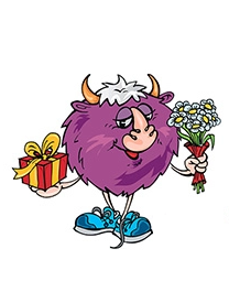
3. Characters (mascots). It is the so-called "face of the brand". It is well remembered and evokes powerful associations with the store. An example of a character on the Yakaboo store logo:
Font logos
1. Abbreviations and acronyms. It is the solution for companies with a long name. When visualizing acronyms, it's essential to choose a readable font that matches the company's philosophy. For example, the well-known brand H&M has an acronym in its name and uses it for its logo:
2. Brand name without additional symbols. The typography for such logos is crucial. A successful example of the absence of extra symbolism on the ZARA brand logo:

3. Combination of font and graphic sign. The universal variant of the logo will be suitable for many online stores. For example, the logotype of the EVA store reflects both the name and the visual hint of "Eve's apple":

Combined logos
- Text and graphic symbols. The combination of image and font also belongs to the universal options. The visual element enhances the effect of the text. Example of a Parfums logo with text and graphic symbols:

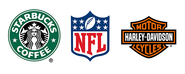
- Emblems. The arrangement of the letters inside the symbol or badge is similar to a variant of coat of arms. This variant is rarely used by stores: it is more suitable for different organizations and educational institutions. Examples of using the emblem as a logo:
Ways to create a logo for an online store
Applying to a professional designer
You can find a specialist on freelance sites or contact a specialized company. The logo will be beautiful and efficient if you set the task correctly. Cons: It may not be affordable at the start of the business.
Create a logo in an online designer
These are services where you enter the name of the online store and specify a few parameters to get a suitable style, color and theme logo. You can edit the resulting logo at your discretion and download it in convenient sizes.
Create your own logo in specialized programs
For example, it can be Illustrator or Photoshop. The pluses are the professional quality of images and complete control over the final result. But this will work if you have sufficient proficiency in the program and have at least minimal design skills.
Checklist for creating a quality logo for an online store
Step 1: Research the market
Identify your key competitors and analyze their logos. It is necessary to avoid repeating and poring over the same ideas. Choose colors, elements, and fonts that don't look like the logo elements of the big stores in your niche.
Step 2: Pen, paper, options
Sketch out ideas in a notebook. No one requires you to be a Raphael master: figure out what you want to see on your store's logo. Create as many variations as you can. Don't stop until you find a few interesting ones.
Step 3. Choose a symbol
The logo should reflect the activities of the online store. It can be a neutral symbol (for example, a basket from the supermarket) or an image indicating the specifics of the activity. For example, the electronics and home appliance store ALLO encoded a picture of a power button at the logo. It creates a solid associative connection. It is essential to choose a unique element. There are hundreds of stores that use the shopping cart icon. But you have to become not "one of" but promote the original brand.
Step 4. Choose a color
The task of color is to convey mood, create associations, attract customers and demonstrate direction. Poorly chosen shades can even scare customers away. The colors most commonly used for online sales are blue, red and green.
Step 5. Choose a font
It provides the perception of the logo, and recognition depends on it. The ideal font for a logo:
- legible and understandable in any size - from the text on a business card to lettering on a road sign;
- blends well with the symbol of the logo - for example, if the logo is simple and neutral, the font should also be concise;
- without fine details - it is better to refuse stylizations of handwritten fonts, notches and scrolls. Fonts with straight lines are excellent: Souvenir, MagistralC, Micra. You can download completely free and legal fonts from Google Fonts.
Step 6. Choose the combinations and arrangement of the logo elements
Here is a vast field for experimentation. The different placement of the image and lettering directly affects the overall perception of the logo. Even the distance between them can make a difference. Therefore, you need to develop several options and choose the most successful, perhaps by direct testing on the audience.
Step 7. Find someone to discuss ideas with
Show your options to a few people: family members, employees, and friends. Let everyone have their opinions. Listen to their comments, and take note of the most valuable ones. Maybe they will give you the impetus for new ideas.
Step 8. Visualize your logo
You may design a digital version of your logo by yourself or with the help of an online constructor. Ideally, you can create several variants to test and settle on one.
Step 9. Check your logo
Here's a short list of criteria to assess the quality of the symbol you've created:
-
it's easy to describe in two or three words;
-
it makes all the associations but doesn't directly relate to your line of work (remember the hackneyed trash can icon);
-
it targets your audience clearly;
-
the logo uses 1-3 colors;
-
the symbol is easily scalable without loss of recognition;
-
it has no visual effects, or their number is minimal;
-
there are no complex elements or patterns;
-
the distance between the items is uniform;
-
one font without serifs and scrolls is used.
Step 10. Perform testing
You can ideally do this on your target groups using the A/B testing tools in Google Analytics or another service. But you can survey subscribers on a social network or among the site's customers. Stop at a logo that elicits a more positive reaction from the audience.
Step 11. Keep an eye on trends
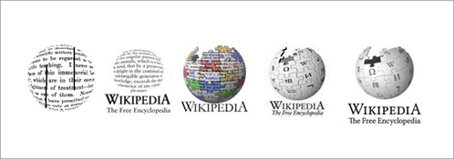
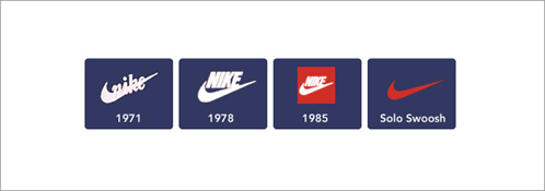
No one says you need to redraw the symbol again with every change in logo design fashions. But you'll probably have to update, simplify, and change the color scheme over time. Watch the evolution of famous brand logos to see that it's a natural process.
Instead of a conclusion
A logo is a must for an online store. In the background of growing competition, branding helps to occupy a niche and form a loyal target audience. Nowadays, it is realistic to create your sign, even without special programs. The main thing is to follow the development rules, avoid plagiarism and follow the trends.

